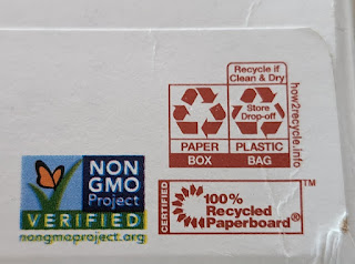
Clear recycling instructions?
I was being a bit snarky last time around, and found that one symbol from the recycling foundation who was trying to make recycling instructions more clear but yes, I started off with a bad example of a non-recyclable multi bag. Here are some other examples of that symbol that I found in the cupboards:
In these examples we have "Paper - Recycle", "Plastic Bag - Recycle if clean & dry - Store Drop off", "Plastic Bottle: empty & replace cap" and "Empty Tub: discard seal & replace lid" (from a plastic tub of cat treats).
These are all useful, and they also indicate how fragmented and messy our current attempts to recycle are.
Other symbols in this batch are:
Certified 100% recycled paperboard
A full-color variation of the Non-GMO logo from my last post.
Certified Organic, by Quality Assurance International
Brewed In USA (no organization or URL given)
Rainforest Alliance on an iced tea bottle
A BCTGM logo that I thought was an extended category of Kosher, but turned out to be "Bakery, Confectionary, Tobacco Workers & Grain Millers - Union Made" which is so wordy and specific it hardly registers as words.
And finally we have this weird little stick figure that says "Let's Play" from a 12-pack of zero sugar ginger ale. The figure seems to be splashing in a puddle or crushing a can with his foot or maybe he stepped in doo-doo. It's hard to tell. But letsplay.com is a real thing, and their page starts with the bold mission statement: "Keurig Dr Pepper created the Let's Play initiative to provide kids and families with the funding, equipment and playspaces to help make active play a daily priority." Further down "4,750 sports equipment and playspace grants were awarded to youth-serving organizations across North America." It's hard to argue with results like that for a good cause.
The point is that each of these symbols means something to some group of people while the rest of us don't even know they are there. Some consumers might ONLY buy products if they have a letsplay logo or the rainforest sticker, because those things are important to their lives. So I will continue to look into them from time to time and see what is behind the little circles and swirls and abbreviations.


Comments
Post a Comment